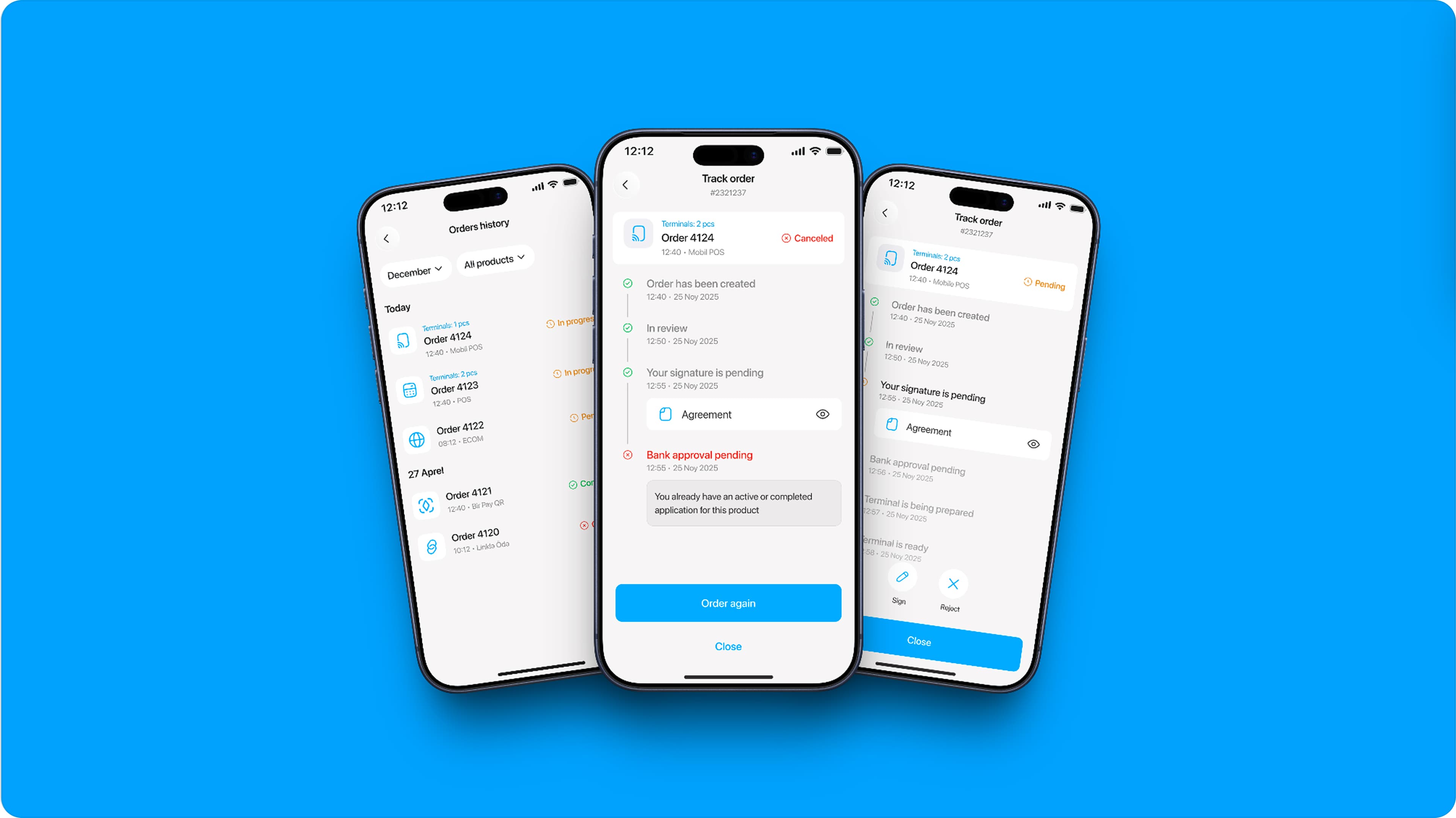
Birbank Biznes — Order Tracking for Acquiring
Birbank Biznes is the business-banking app in the Birbank ecosystem, and its Acquiring products are how merchants take payments — POS, Mobile POS, E-Com, Pay with link and Bir Pay QR. Ordering one used to end at "order placed": provisioning, review, signing and delivery all happened out of sight, so merchants phoned the call centre to ask where their order was. The work was less about drawing a timeline than deciding what a merchant should actually see — twelve backend statuses became four, and ten operator-written rejection reasons were rewritten in the customer's voice.
- Role
- Product Designer
- Timeline
- 2025
- Platform
- Web · iOS · Android
- Client
- Kapital Bank · Birbank Biznes
- Team
- Acquiring Squad
- Skills
- Product DesignDesign SystemsComponent DesignUX Writing
- Acquiring products
- 5
- Statuses shown to merchants
- 12 → 4
- Fewer status calls
- ~70%
Background
The call centre was the status page
Birbank Biznes is the business-banking app in the Birbank ecosystem, and its Acquiring products are how merchants take payments: POS, Mobile POS, E-Com, Pay with link and Bir Pay QR.
Ordering one used to end at "order placed." Everything after — review, signing, bank approval, provisioning, delivery — happened where the merchant couldn't see it. So they called to ask. The call centre became the de facto status page, answering the same question over and over: where is my order?
That framing matters, because it makes the problem an editorial one rather than a visual one. The data already existed; the bank knew exactly where every order was. What didn't exist was a decision about which parts of that a merchant should be shown.
The model
Five products, five different journeys
The obvious assumption — one sequence of steps, five products running through it — turned out to be wrong. Fulfilment genuinely differs, and the journeys are different lengths: POS runs six steps, Mobile POS and E-Com five, Pay with link four, and Bir Pay QR just two.
The differences aren't arbitrary. Pay with link has no hardware to provision, so it never waits on bank approval of a terminal. Bir Pay QR needs no signature, no hardware and no sign-off at all — it goes from created to ready. Padding QR out to six steps for the sake of symmetry would have been a lie told to make a grid look tidy.
What they share is a vocabulary: order created, in review, your signature is pending, bank approval pending, terminal being prepared, terminal ready. Each product composes its own sequence from that shared set, and each step can be waiting, done or failed.
That is what made a component the right answer instead of five screens. The unit of reuse isn't the journey — it's the step.
The component
One tracking cell, four states
I contribute to the Birbank design system, so tracking was built as a universal tracking cell
rather than a screen. One State property — Default, Pending, Success, Fail — plus
two optional slots for a document or images. That is enough to carry every step of every product's
journey, including the awkward ones: the signing step holds the agreement, a failed step holds its
reason.
Steps & states
Twelve statuses, four worth showing
An order moves through twelve statuses on its way from placed to delivered. A merchant needs four.
Almost all of them collapse into a single In progress. The handoffs between internal review stages are real work and matter to the bank, but they are invisible to the merchant and change nothing about what they should do next. Completed and Canceled are the terminal pair. The one status pulled out on its own is Your signature is pending, because it is the only point where the order has stopped and is waiting on the merchant. Surfacing it as its own state is the difference between the merchant knowing they're the blocker and assuming the bank is slow.
The internal steps still exist and still drive the timeline's progress — they just don't get their own line.
Rejection reasons, rewritten
The same exercise ran over the ten rejection motives an operator can select. They were written for internal record-keeping, and it shows — third person, hedged, occasionally instructing the operator rather than telling the customer anything. I rewrote them for the person who receives them.
- Operator's wordingCould not contact the customer, or no response was received
- What the merchant readsWe couldn't reach you
- Operator's wordingCould not contact the customer because the contact number is deactivated
- What the merchant readsWe couldn't reach you because your contact number is inactive
- Operator's wordingThe customer or their business activity does not meet the product's requirements
- What the merchant readsYour business activity doesn't meet the product's requirements
- Operator's wordingThe application could not be processed for system or technical reasons
- What the merchant readsThe application couldn't be processed for technical reasons
- Operator's wordingThe customer already has an active or completed application for this product
- What the merchant readsYou already have an active or completed application for this product
- Operator's wordingThe application was declined at the partner's own request
- What the merchant readsYou cancelled the application yourself
- Operator's wordingOther (operator comment mandatory)
- What the merchant readsOther
The pattern across all ten is the same three moves: second person instead of third, drop what the customer can't act on ("system or" adds nothing to "technical"), and stop assigning blame the bank can't substantiate — "the customer … does not meet the requirements" becomes a statement about the business activity, which is the part that was actually assessed.
Every string was written in three languages — English, Russian and Azerbaijani — since all three ship in production. A rejection reason is only doing its job if it lands in the language the merchant reads the app in.
A failed order ends there. The remaining steps aren't greyed out, they're removed — the process never resumes from a rejected order, so leaving them on screen would imply a wait that will never finish. The primary action becomes Order again, which is the only thing left to do.
Web & mobile
Same cell, different container
Tracking ships in the mobile app and in the web app, and the two surfaces are not the same shape. Web is a workspace: a paginated table of orders with product tabs and a date range, and tracking opens as a side panel over the list, so the merchant never loses their place. Mobile is a feed with sheet filters, and tracking is a full page pushed onto the stack.
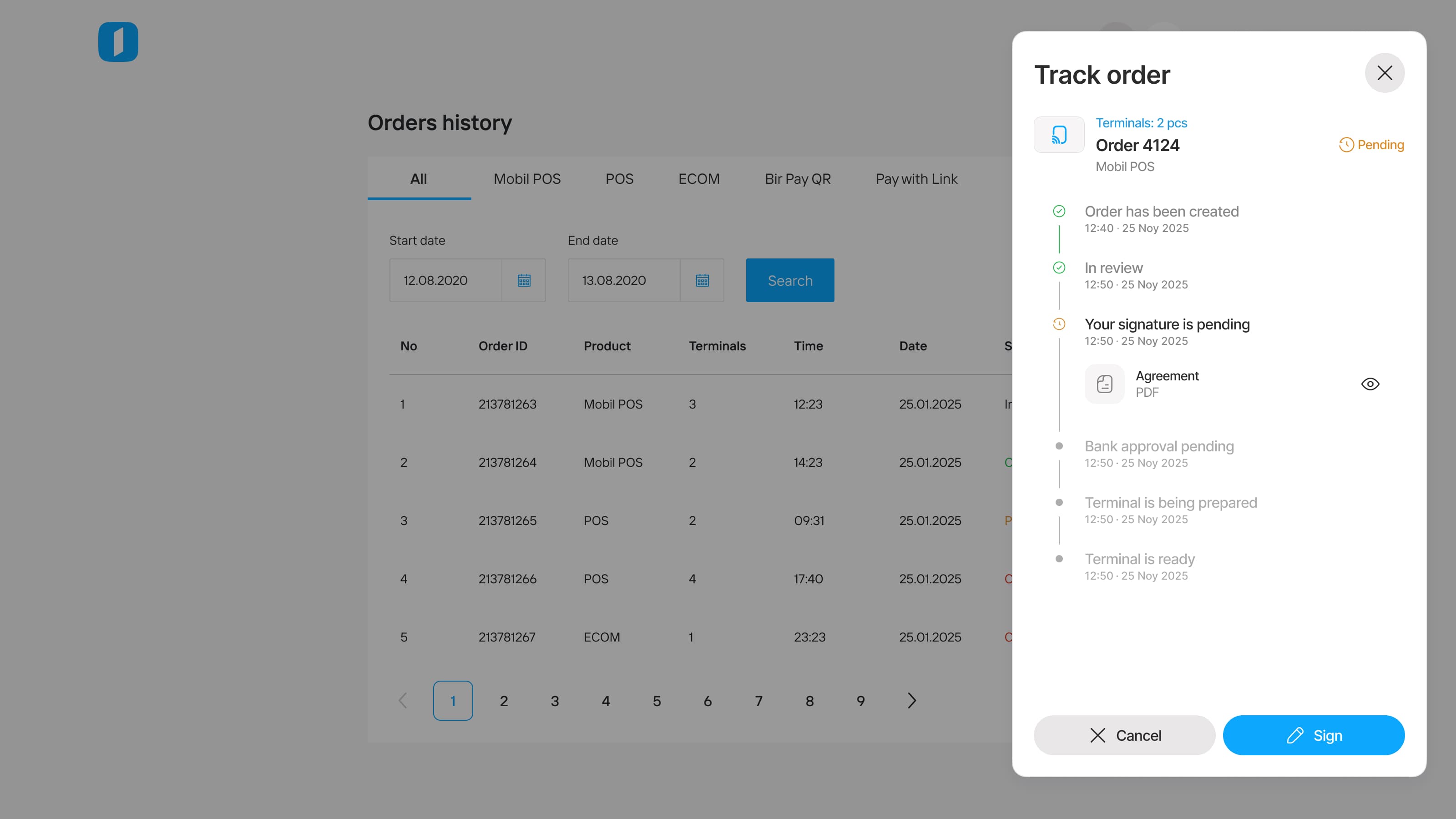
Inside the container, nothing changes. Same steps, same four states, same attachment row, same wording. Only the actions get re-housed — footer buttons on web, icon buttons on mobile — and signing runs through ASAN İmza on both.
Outcome
What shipped
Order tracking is live across all five acquiring products, on web, iOS and Android. Status calls to the call centre dropped by around 70%.
The tracking cell went into the Birbank design system as a component other teams can use — which was always the more durable half of the work. The editorial half is harder to reuse and mattered more: the decision about which twelve statuses become four, and what a rejection sounds like when it's addressed to the person it happened to.
Next project
Peezy - Design Handoff Tool