Statizen - Interactive Map
Azerbaijan's statistics office publishes real regional data, but it arrives as dozens of spreadsheets nobody outside the office reads. Statizen turns that into one screen: pick a region, pick an indicator, scrub the year. 32 indicators across 10 chapters and 14 economic regions. Designed in Figma and shipped end to end in seven days.
- Role
- Product Engineering
- Timeline
- May 2026
- Platform
- Web
- Team
- Solo — design and build
- Skills
- Product DesignData VisualisationInteraction DesignFront-end Engineering
- Indicators across 10 chapters
- 32
- Economic regions
- 14
- Concept to production
- 7 days
Context
The data was public. It just wasn't legible.
Azerbaijan's State Statistical Committee publishes a great deal of regional data — employment, wages, births, crime, tourism — and it is genuinely open. There is even an official interactive map.
It is more comprehensive than what I built: three geographic levels down to individual districts, eleven years, twenty-two indicator categories. But the map opens grey, and stays grey. Every category is collapsed. To see a single number you choose a geography level, expand the right category, find the indicator inside it, and pick a year — four decisions before anything appears, and the map itself stays passive throughout.
That is a reasonable tool for someone who already knows which indicator they came for. It is not built for the far more common question: "what is it like where I live?"
So the brief wasn't more data or better data. It was a different starting point — one screen, no onboarding, something on the map before you touch anything. A visitor should be able to answer a question without first being taught the interface. That ruled out dashboards, filter trees and chart libraries early: the shape of the answer here is a place and a number, so the interface should be a map and a number.
The map
Drawn, not projected
I drew the 14 economic regions as vectors in Figma and used that geometry directly, rather than rendering from a geographic projection. The map is therefore a designed object: silhouettes simplified for legibility at small sizes, proportions kept honest, but no obligation to a coordinate system nobody is checking.
Hand-drawn geometry has a cost — neighbouring shapes have to be made to share their borders exactly, or the seams show. That's handled in the build, so the 14 regions read as one surface rather than 14 stickers.
Selecting a region zooms to fit it, and dims the rest. Dimming is fussier than it looks: fade a region with a single opacity and its stroke stays at full strength wherever it meets a neighbour, so the borders you are actually looking at never dim. Fill and stroke fade separately.
Some regions are genuinely several shapes — Baku has Caspian islands, two others have outlying fragments. Those are kept and rendered distinctly, so a fragment sitting inside a neighbour's outline doesn't read as part of it. Spurious inner rings left over from drawing are dropped. Telling a real island from a drawing artifact isn't automatable, so I did it by hand.
Interface
One number, three languages, any year
The whole product is a single screen. Chapter, indicator, region, year — four controls, no navigation, no page loads. Selecting an already-selected region deselects it, and clicking the background does too, because that is what people try first.
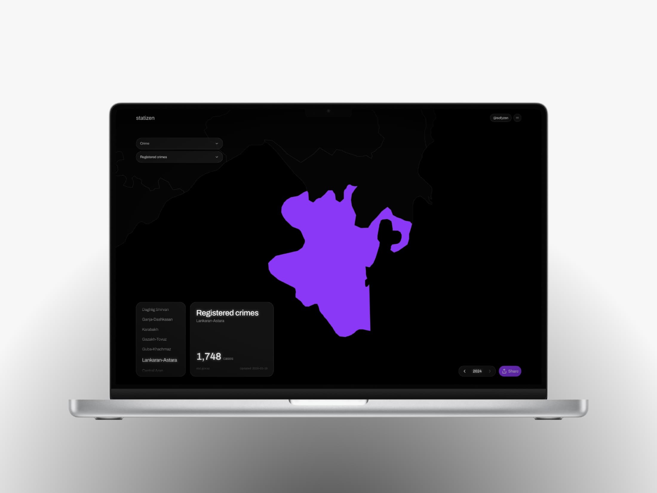
Rather than show it, here it is — the real map, the real numbers. Click a region to read its value, switch the indicator, and watch the rest of the country step back.
It runs in English, Azerbaijani and Russian, including the indicator names, which are written by hand rather than lifted from the source spreadsheets — those carry section numbers and bureaucratic phrasing that doesn't translate. Numbers follow local convention too, down to the digit grouping Azerbaijani readers expect.
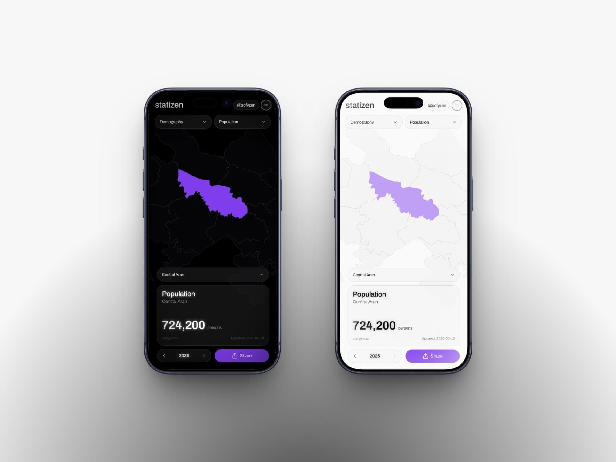
Light, dark and system themes, resolved before the first paint so the page never flashes the wrong one — and the whole thing is built to be read on a phone, which is where most people will meet a statistic someone sent them.
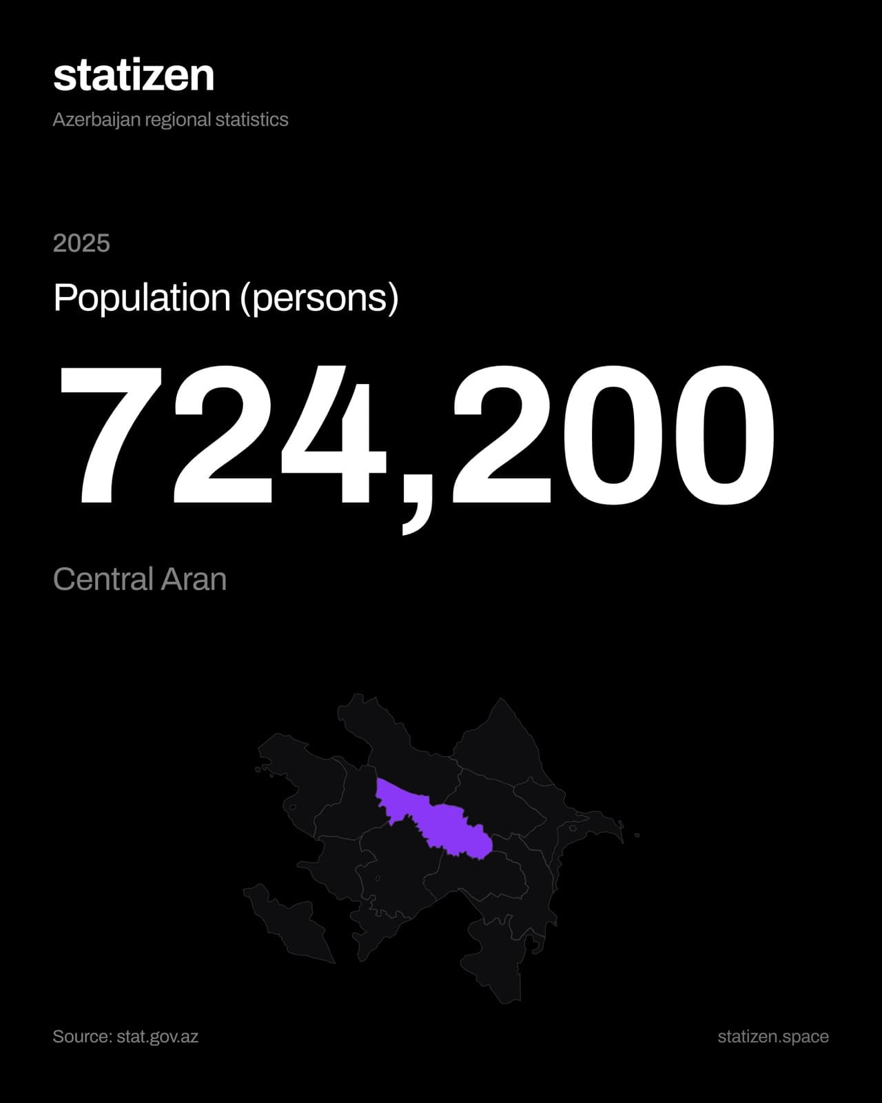
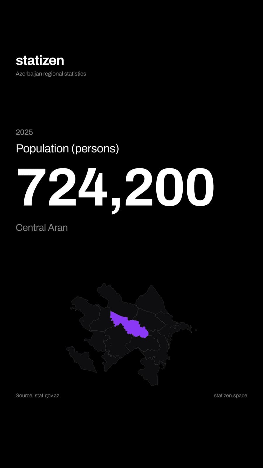
Anything on screen can leave as an image. The share sheet exports the current view as a picture or a PDF, in a 4:5 post or a 9:16 story — the story version laid out so Instagram's own chrome doesn't cover the title or the source line. Sharing a statistic is the actual use case; a screenshot of a browser window isn't good enough for it.
Method
A week ago this was a Figma file
The seven days split cleanly into three jobs, and the order mattered.
Design first — every pixel in Figma. Map geometry, type scale, motion language, share-card layouts. Not wireframes: the actual thing, decided before any code existed. That's why the map is drawn rather than projected, and why the share cards have a layout rather than a screenshot.
Then engineering, driven rather than typed. I ran an AI coding agent end to end against those decisions — Next.js, TypeScript, Tailwind, Framer Motion, Zustand. The agent is fast at the parts that are already decided, which is exactly why the Figma work came first.
Then the data. A Python pipeline parsing the source files, with no estimates and no smoothing.
The interesting part isn't the speed. It's what the speed exposes: when implementation stops being the constraint, the quality of the product collapses back onto the quality of the decisions. Every judgement in this case study — dimming fill and stroke separately, keeping the islands, dropping the slider, refusing the choropleth — is a taste call. None of them were made faster by tooling.
AI didn't replace the product design here. It removed everything standing between the design and a live URL.
Where it stands
Live, and deliberately unfinished
Statizen is live at statizen.space, with the source on GitHub.
Behind the interface is a pipeline that pulls the source files, parses them and refuses to guess: nothing is interpolated or smoothed, and every value carries the file and year it came from. Where the office only publishes district-level figures, they're summed using its own official grouping — never estimated. That work is invisible, and it is the reason the numbers on screen can be trusted.
It also leaves things out on purpose. There is no colour-coded choropleth: a single colour scale across indicators measured in manat, percentages and head counts invites comparisons that aren't real. There are no trend lines and no forecasts. The site adds no analysis — it makes existing official statistics legible, and leaves the interpretation to whoever needs it.
Next project
Birbank Travel — Passenger Flow