Peezy - Design Handoff Tool
Peezy is a Figma-inspect and design-handoff tool: a plugin sends a frame to a kanban board, and the card becomes an interactive spec — layers, spacing, tokens, CSS. It closes the gap where the spec and the work item live in different tools, so one of them is always stale. I designed it, built the full stack, and shipped it solo in about three weeks — orchestrating AI coding agents to get from a designer's idea to a production SaaS with a published Figma plugin and realtime sync.
- Role
- Product Engineering
- Timeline
- Mar — Apr 2026
- Platform
- Web · Figma plugin
- Team
- Solo — design, full stack, plugin
- Skills
- Product DesignFull-stack EngineeringAI-Assisted DevelopmentFigma Plugin Development
- First commit to shipped
- 26 days
- AI-agent build sessions
- 64+
- Person — design, stack, plugin
- 1
Context
By the time you build it, the spec has moved
Design handoff leaks. A developer needs a padding value, a hex code, a font size — and the answer is in Figma, or a screenshot the designer annotated, or a Slack thread, or a Notion page, or nowhere. The spec scatters across the tools nobody agreed to keep it in, and three weeks later no one can find the number that was decided.
The real problem underneath is that the spec and the work item live in different tools. The design is in Figma; the task is on a board; the two drift, and one of them is always stale. Reading a design shouldn't mean opening a second app and hoping it still matches the first.
Whatever fixed this would have to put the spec and the work in the same place — so the thing you're tracking is the thing that was handed over.
The idea
The card is the spec, not a link to it
A kanban card normally holds a title and a link. The link points at Figma, Figma moves on, and the card quietly starts lying.
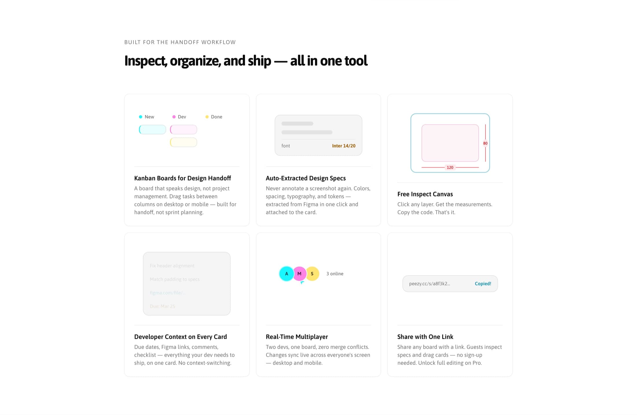
Peezy inverts that. The extracted design is the card's content — layers, measurements, tokens, generated code, all attached to the thing being tracked. If it's on the board, it's ready to build, and what you're looking at is what was handed over.
That decision propagates all the way down. Card types are task, component, screen, bug, feature and chore — design objects, not sprint objects — and a coloured corner flag encodes the type at a glance. The default board runs New → In Development → Designer Review → Done, so the designer's approval is a column rather than a favour asked in Slack; the Design Handoff board above is one team's edit of that. Boards share by link, and a guest can read specs and move cards without an account, because the person who needs the padding value is often the one who was never given a seat.
The flow
Select in Figma, send, inspect
The handoff is three actions and no tab-switching. Select a frame in Figma, click send in the plugin, open the card.
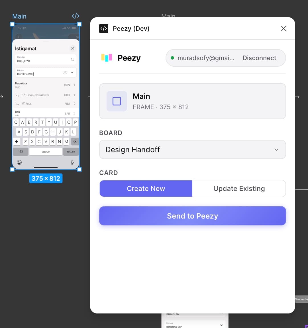
The plugin is deliberately a dumb pipe — it reads the raw Figma node and hands it to the backend, plus runs the cheap, deterministic spec extraction locally. That keeps the surface small and the failure modes obvious: what it sends is exactly what Figma reported.
Inspect
Layers on the left, canvas in the middle, truth on the right
Opening a card in inspect mode gives the three-column layout the job actually wants: the layer tree, the design itself, and the properties of whatever is selected.
Three details carry most of the weight here.
Measurements are drawn on the design, not listed beside it. Padding and gaps render as annotations on the canvas, in the place they describe, which is how anyone reads spacing when they have the file open.
Named values beat raw ones. Where a fill or a text style resolves to a token, the panel shows
primary or radii.md next to the hex and the pixel value. A developer copying #6366F1 has to
guess; one copying primary is using the system. Selecting a component instance shows what it came
from — source, variant, size — so a developer can tell whether they're looking at a one-off or a
system component before they build it.
Every property shows its CSS underneath. Direction: row sits above flex-direction: row in
grey — so the panel teaches the mapping rather than just asserting a value, and the code tabs (CSS,
Tailwind, JSX) are a shortcut, not the only way to get the answer.
Rather than describe it — here it is. Peezy's own inspect interface, running against a sample file. Click any layer on the canvas, or pick one from the tree.
Updated the color tokens in the design system for dark mode support.
Tap a layer to inspect
Properties, tokens, and components
In the product this interface also runs in dark, resolved from the system setting with no manual toggle to forget about. The copy above is fixed to light, so it belongs to this page rather than fighting it.
The engine
Measured locally, interpreted with a model
What makes the extraction trustworthy is a split in how it reads.
Reading a design is deterministic. Spacing, colour, type and layout are already in Figma's own node properties — the plugin computes them locally, exactly as drawn, with nothing to get wrong. The whole inspect canvas, layer tree and property panel run on that path, so what a developer copies is a measurement, not a guess.
Interpretation needs a model. Deciding that a frame is a screen rather than a component, naming things, summarising intent, generating Tailwind or JSX — that is judgement, not measurement, and it runs through Claude on the backend, metered and cached.
Keeping those two apart is the architecture decision the whole product rests on. Putting the AI behind an explicit boundary — instead of letting it seep into the parts that should be exact — means the reading stays honest and the interpreting stays contained. Measurement is deterministic; only opinion gets a model.
Scope
Knowing what to cut
Peezy did not start this focused. Its working title was Fast Kanban, and the plan was much bigger: a mobile-first PWA with six vertical "environments" (dev-designer, developer, content, freelancer, startup, student), a mirror-card system that copied a card into a developer's own board and mapped columns across the two, a QA overlay that onion-skinned the built screen against the Figma frame, PR and version-history integrations. A platform.
I built enough of it to see the shape — the environment config for two of the six presets is still in the codebase — and then cut almost all of it. What shipped is one wedge: Figma inspect without a Dev Mode seat. The mirror cards, the QA overlay, the marketplace of environments: planned, and deliberately not shipped.
The cut is the design decision I'd defend hardest. A platform with six audiences has no sharp answer to "why would I open this today"; a tool that hands a developer the exact spec, on the card they're already tracking, does. Narrowing the vision to a single, nameable job is what turned a moodboard of features into something a developer could adopt on a Tuesday.
Build
Built solo, paired with AI agents
I am a designer. Peezy is a production SaaS: Next.js 16 and React 19, Postgres through Drizzle,
Supabase for auth and realtime, Zustand with Immer for board state, @dnd-kit for dragging,
Stripe for billing, Sentry for monitoring, three OAuth providers including Figma's, and a published
Figma plugin — roughly 2,800 lines of TypeScript on its own — doing the extraction. Optimistic
updates with a 50-entry undo stack that skips history while a drag is in flight. 207 commits
between the 8th of March and the 2nd of April.
I did not write most of that by hand. I drove it — through 64+ structured sessions with AI coding agents, against a 45-page build log that kept intent, decisions and constraints in one place so each session started with context instead of from zero. The agents wrote the code; I made the calls: what the product is, where the AI boundary sits, that reading should be free, that a designer's approval is a column. The parts that needed a human — the judgement, the taste, the scope cut above — stayed with the human.
That is the skill this project is really about. Not "a designer who can also code," but a designer who can hold a whole product argument end to end — from the handoff thesis to the plugin's node extraction to a bottom-sheet haptic — by directing AI to build faster than a solo human could, without handing any of the decisions away. The same instinct runs through the product itself: Claude does the interpreting, a person decides what's worth interpreting.
Craft
Built for the phone it will actually be opened on
Handoff gets checked on a phone — in a standup, in a hallway, away from the desk. So the board is not a desktop layout squeezed into a narrow viewport; the whole inspect canvas comes with it.
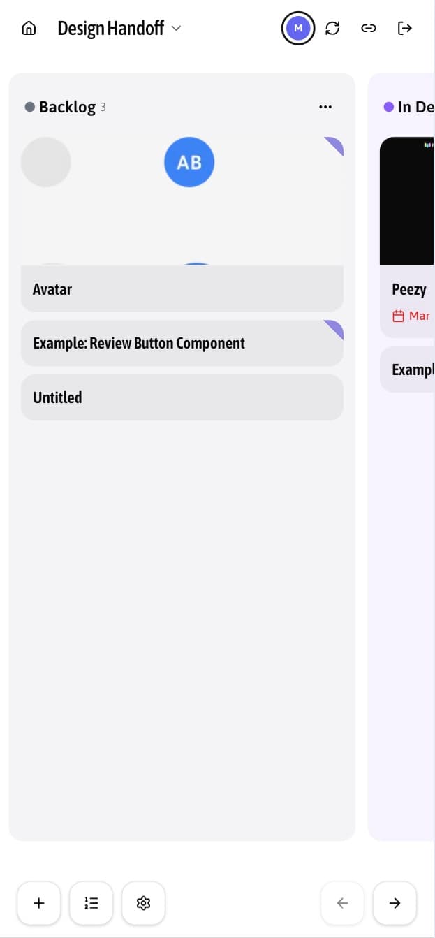
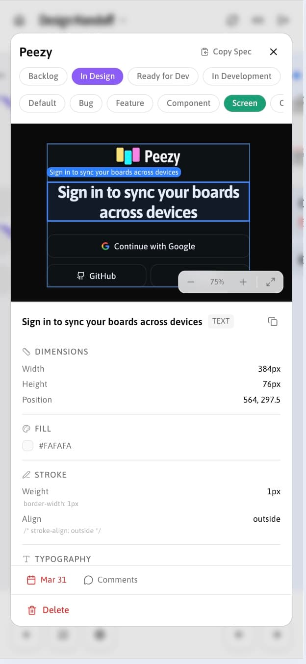
Drag handles are gone on touch; a long press of 200ms starts a drag instead, with a 5px tolerance so a scroll gesture is never mistaken for one. Card details open as a bottom sheet rather than a full-page navigation, which keeps the board underneath and makes closing feel like dismissing rather than going back. Columns peek at their neighbour's edge so it's obvious the board continues sideways. Drag start, drop and error each get their own haptic.
Next project
Birbank — ATM Redesign