Birbank — Loan Payment Redesign
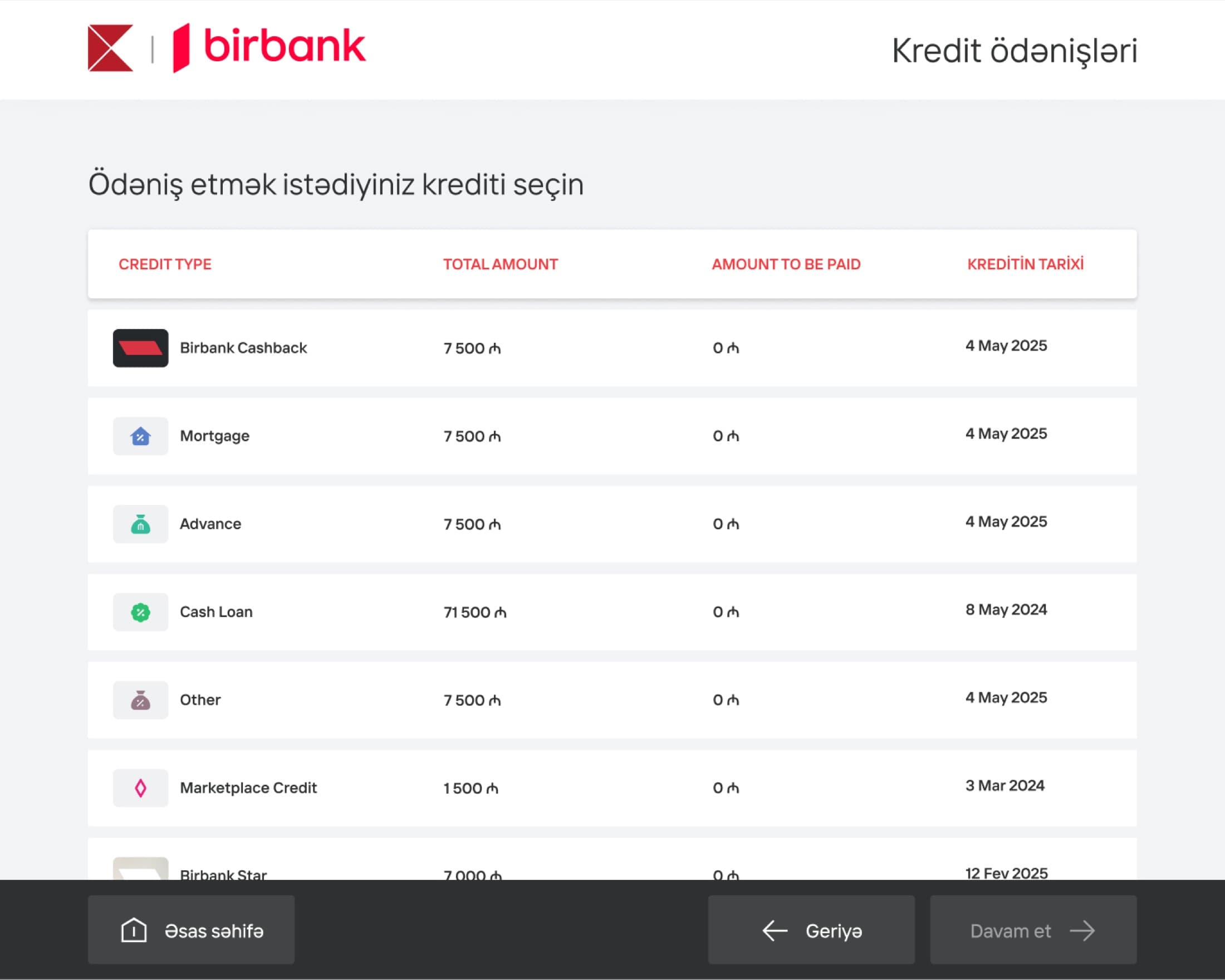
I redesigned the loan payment interface for MilliOn terminals, transforming a cluttered, confusing screen into a clean, intuitive experience. The redesign clarified loan information and introduced QR codes that guide users to the Birbank app for expanded payment options.
- Role
- Product Designer
- Timeline
- 2025
- Platform
- MilliOn self-service terminals
- Client
- Kapital Bank · Birbank
- Team
- Payments Squad
- Skills
- Product DesignInformation ArchitectureDesign Systems
- Payment states, colour-coded
- 3
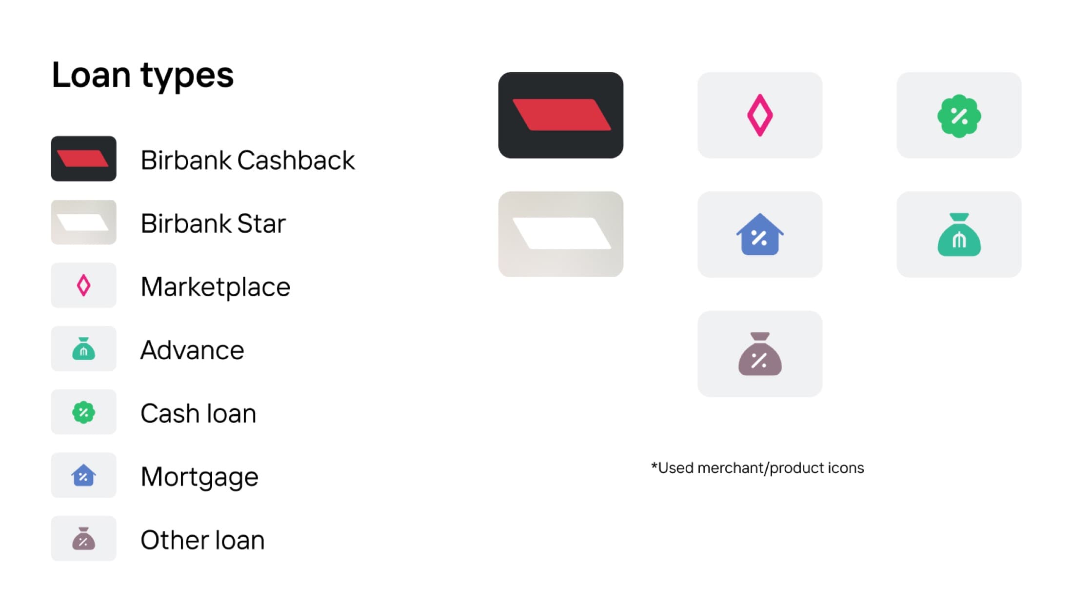
- Loan types given distinct icons
- 7
Challenge
Everything on screen at once
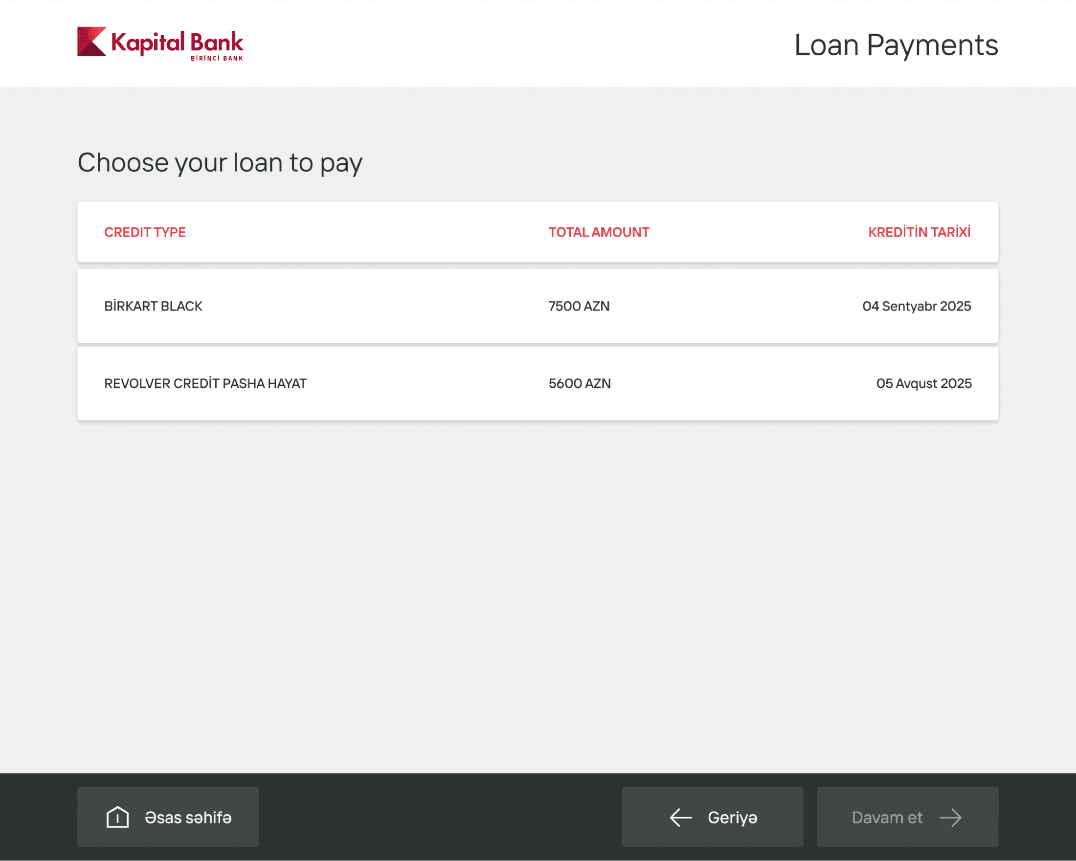
Kapital Bank's MilliOn loan payment screens were cluttered and confusing, overwhelming users with unnecessary information displayed all at once. Call center data revealed consistent user complaints—customers couldn't identify their current monthly debt, didn't understand why they were paying certain amounts, and struggled to differentiate between multiple loan products. The chaotic interface was creating friction at a critical moment in the payment journey.
Action
Rebuilding the Loan Cabinet
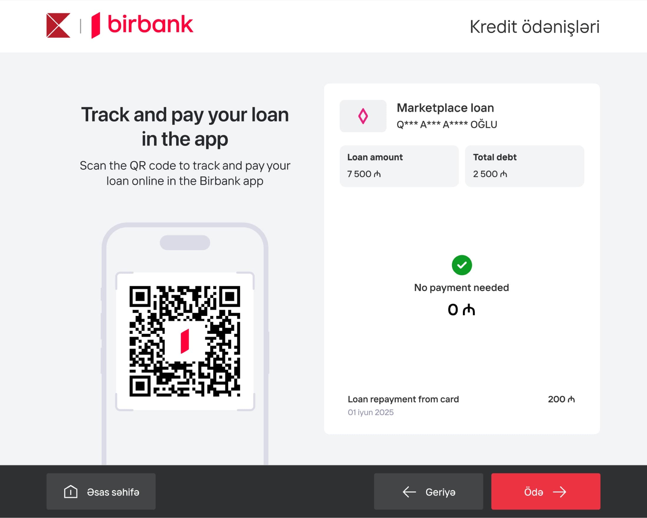
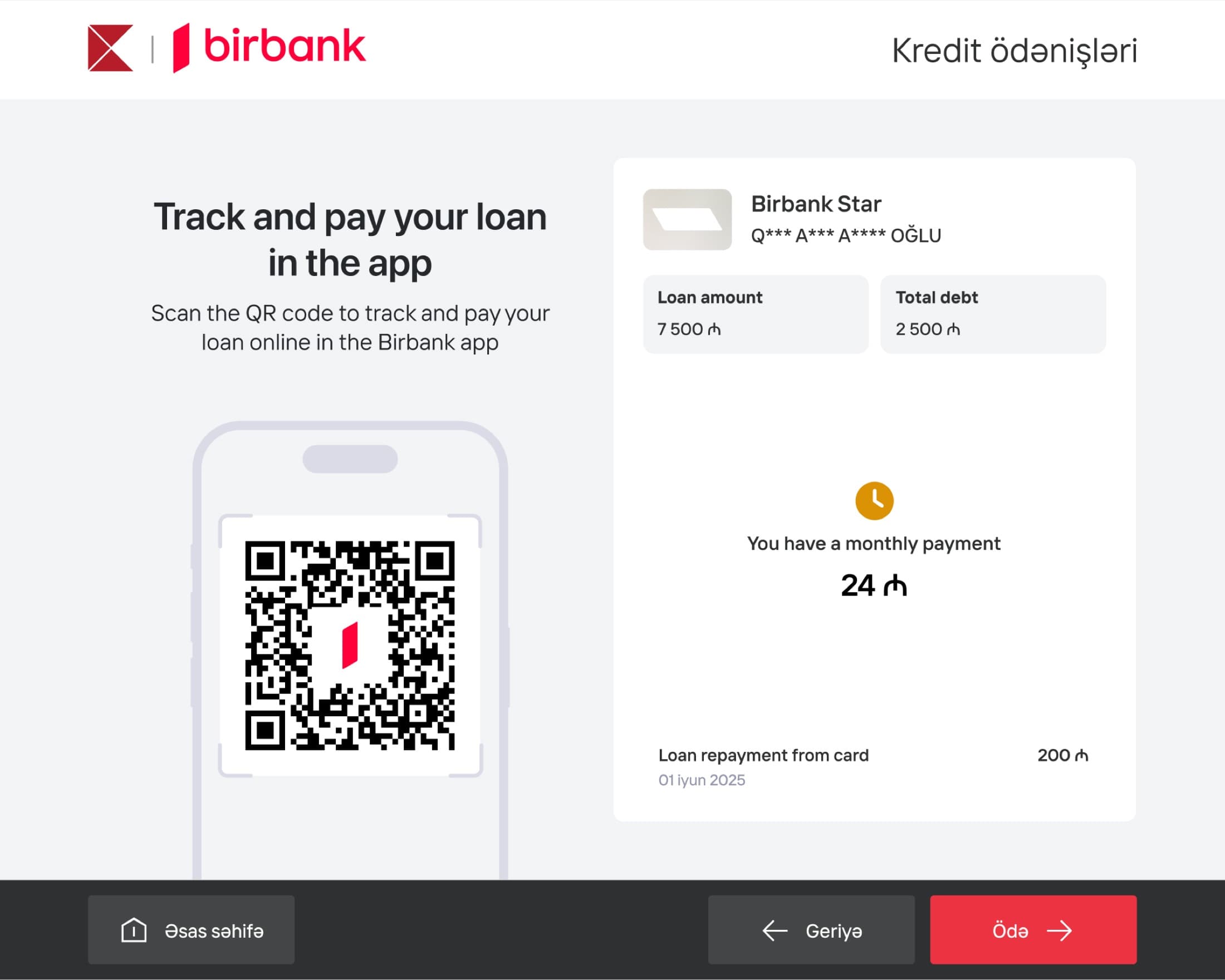
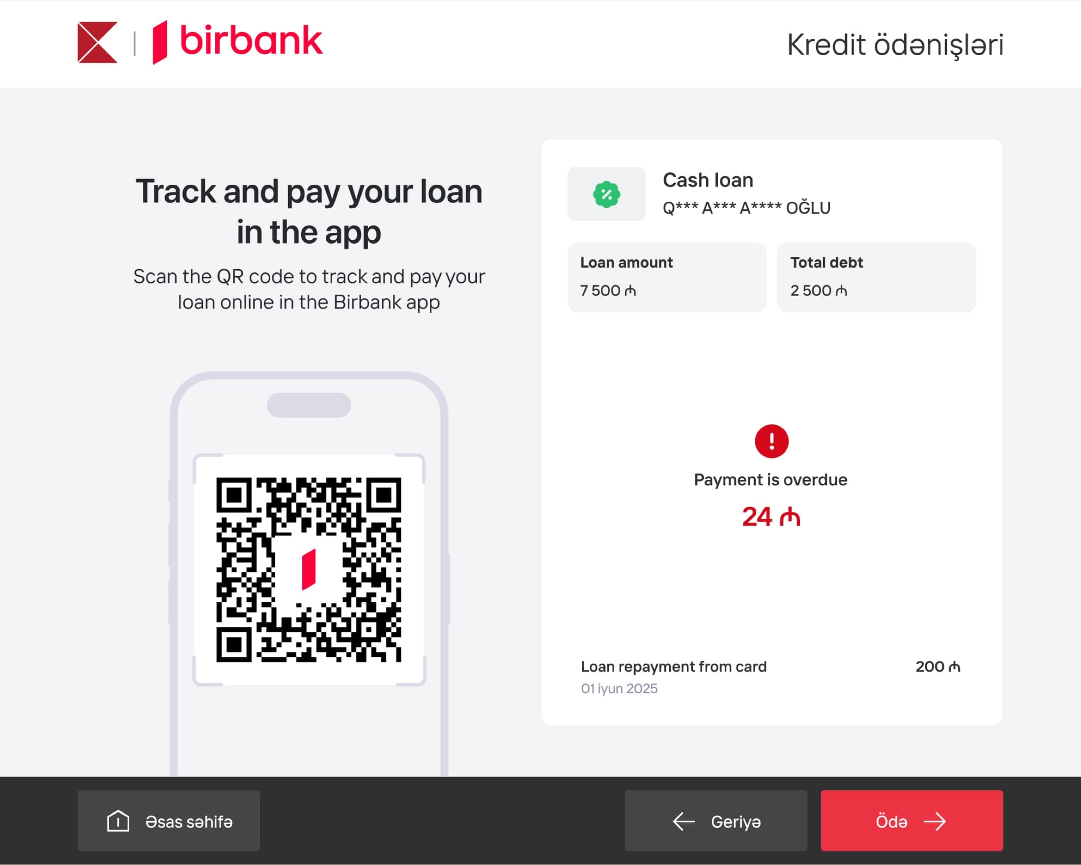
As Product Designer for the Payments Squad, I led the complete redesign of the Loan Cabinet—the screen where customers view their loan payment information at terminals. I minimized information density by creating a clean, focused UI that displays only essential details. Using Birbank's design system, I categorized different loan products with distinct icons and colors, making it immediately clear which loan a customer is viewing.
A critical improvement was introducing clear payment status indicators aligned with the Birbank app. Each loan now displays its current status using color-coded labels: "No payment needed" (green), "You have a monthly payment" (yellow), and "Payment is overdue" (red). This immediate visual feedback helps users instantly understand their payment obligations—a feature the previous version completely lacked.
I redesigned the loan list interface to help users easily differentiate between their various loans before entering the cabinet view. Each loan is now visually distinct and scannable, reducing confusion for customers managing multiple products.
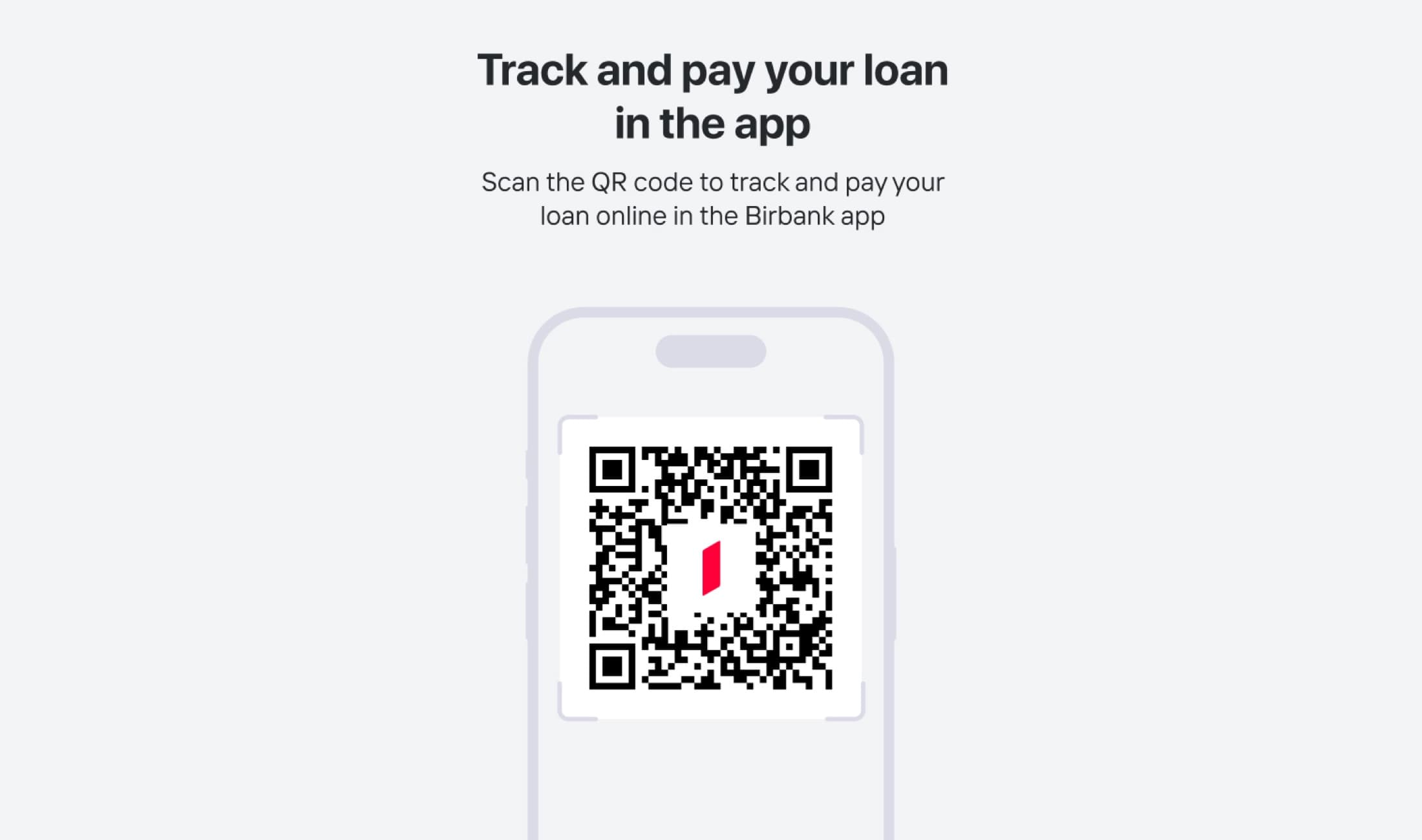
Beyond simplifying the terminal experience, I implemented a strategic feature aligned with the bank's digital transformation goals: dedicated QR codes for each loan product. When scanned, these QR codes direct existing Birbank app users to their detailed loan cabinet with expanded payment options. For non-users, the QR code redirects to app download pages, creating a seamless path to digital adoption while offering customers richer functionality than terminals alone can provide.
Result
Fewer complaints, and a path into the app
The redesign launched in August and significantly reduced call center complaints related to loan payments. The cleaner interface and improved information hierarchy made the payment process more intuitive, eliminating the confusion that had been driving support requests. Usage of the redesigned loan cabinets in the Birbank app increased as customers discovered the enhanced features through QR code prompts at terminals.
The design successfully balanced immediate user needs—making terminal payments clearer and faster—with long-term business goals of driving app adoption. Customers now have a straightforward terminal experience with an easy path to more comprehensive loan management tools in the mobile app.
Next project
Polygraf AI — App