Birbank — ATM Redesign
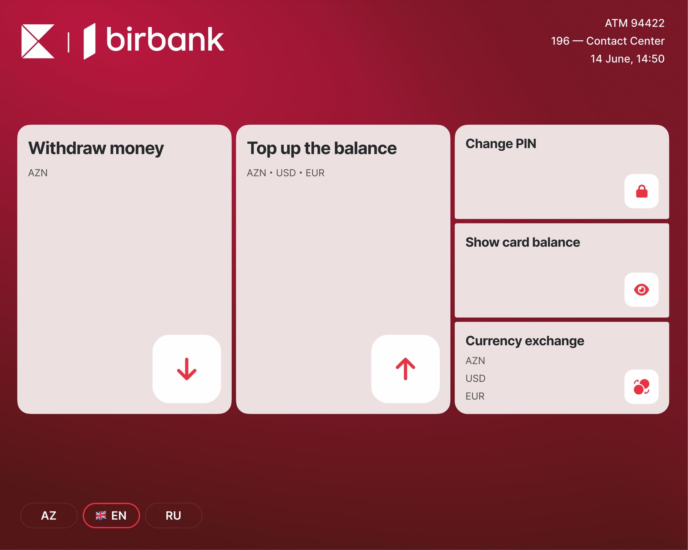
I redesigned Birbank's ATM interface to create a modern, user-friendly experience for next-generation touch-screen devices. The goal was to simplify cardless operations and improve overall usability across all transaction types.
- Role
- Product Designer
- Timeline
- 2025
- Platform
- ATM · Self-service terminals
- Client
- Kapital Bank · Birbank
- Skills
- Product DesignUsability ResearchDesign Systems
- Call-center reports
- −25%
- Next-generation devices
- 70
- Participants in the comparative study
- 6
Challenge
Cardless operations people couldn't finish
Birbank's ATM users struggled with mostly (not only) cardless operations like QR code withdrawals and experienced confusion during card-based transactions. Call center data revealed these usability issues were driving significant support requests, indicating urgent need for interface improvements.
Action
A touch-first interface, and a component library behind it
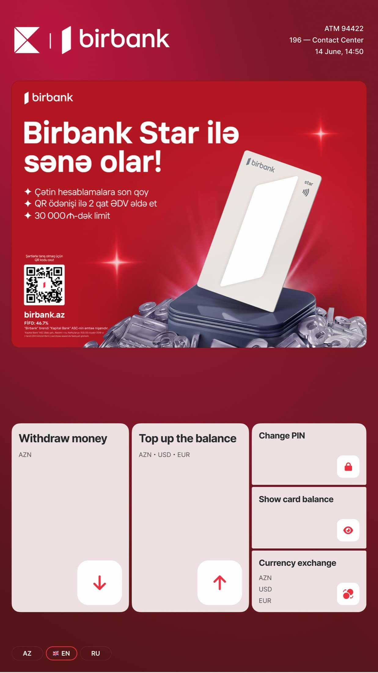
As Product Designer, I led a comprehensive redesign of the ATM experience for Birbank's next-generation touch-screen devices. I redesigned the entire UI component library across 3-4 different screen sizes, ensuring consistency and scalability.
I simplified the main menu structure and optimized core operations—cash withdrawal, deposits, and balance inquiries—for touch-first interaction, moving away from the legacy button-based interface paradigm.
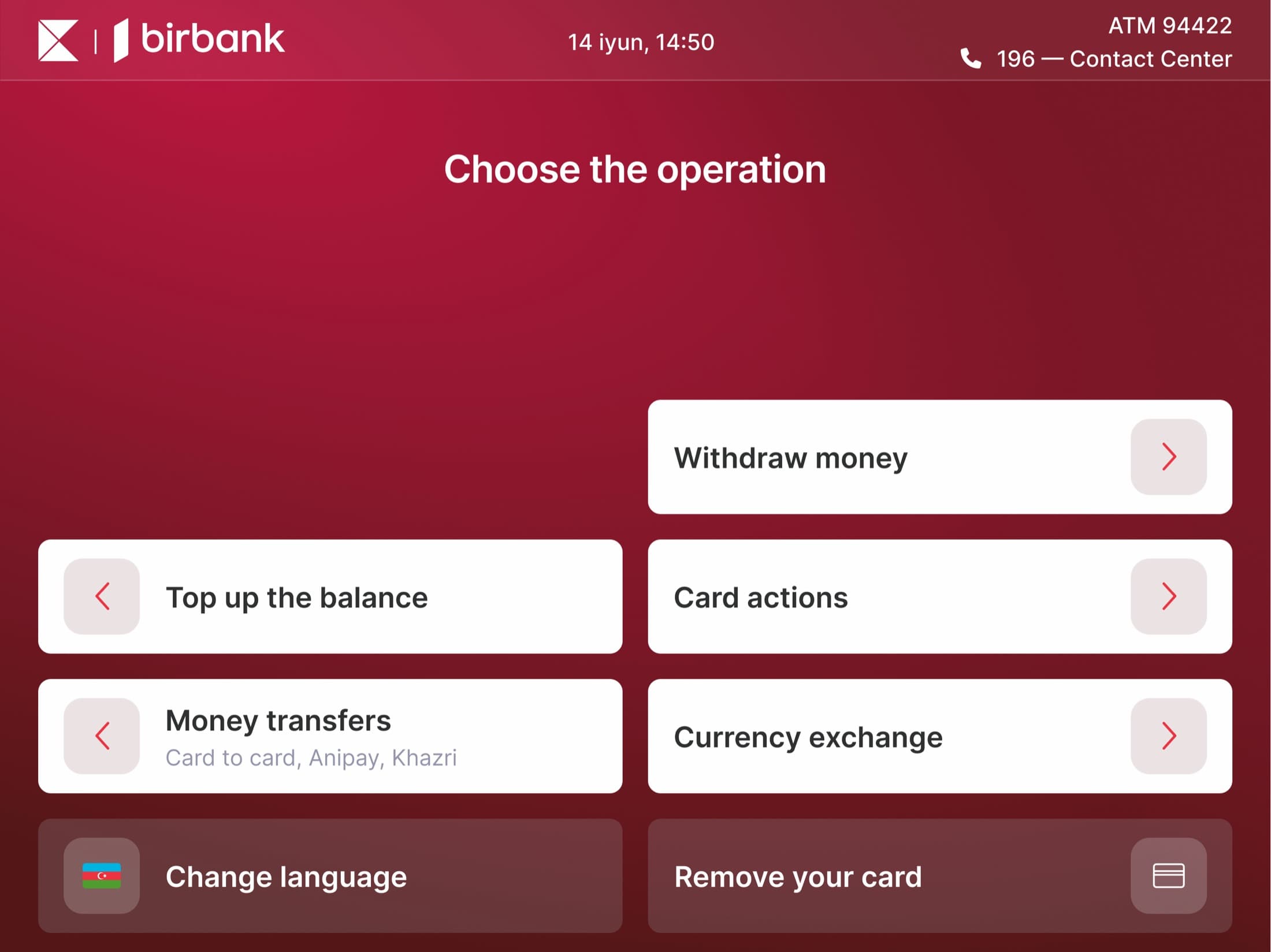
Also redesigned the old, physical buttoned device interface because they are still active, elderly people are more friendly with physical buttons.
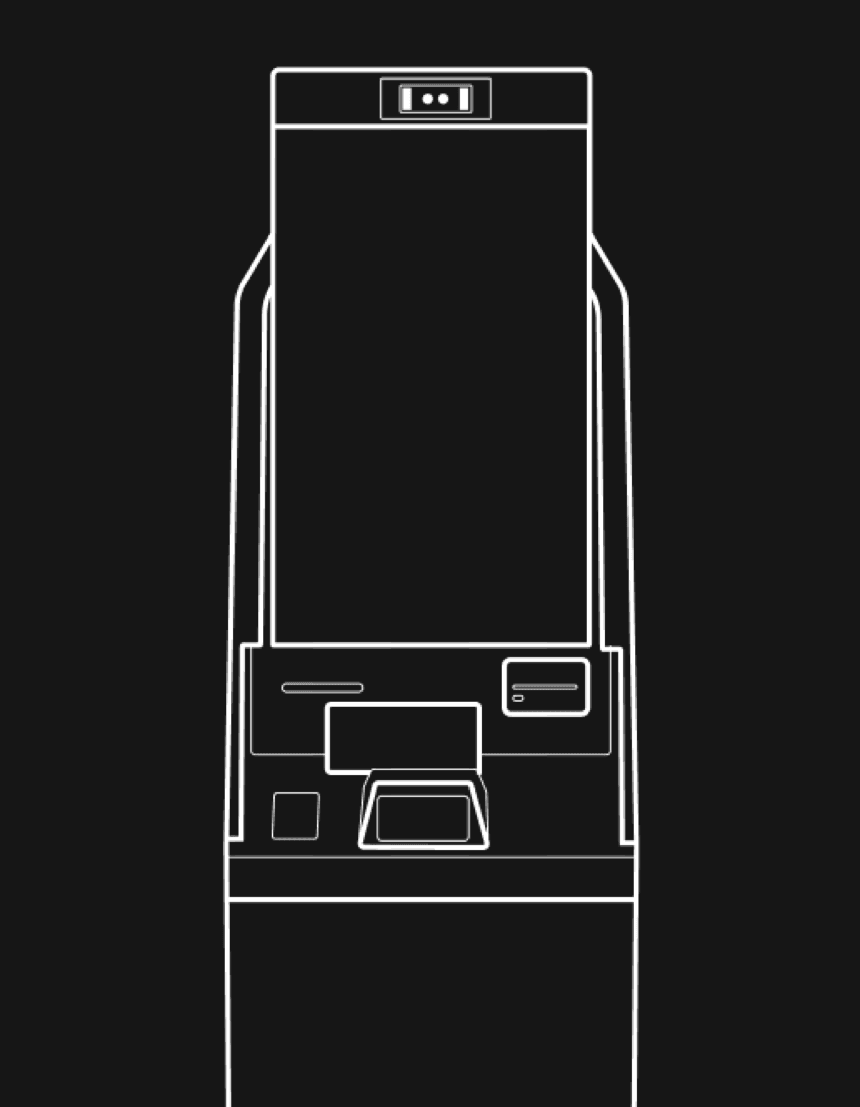
Research
Comparative usability testing across two ATM systems
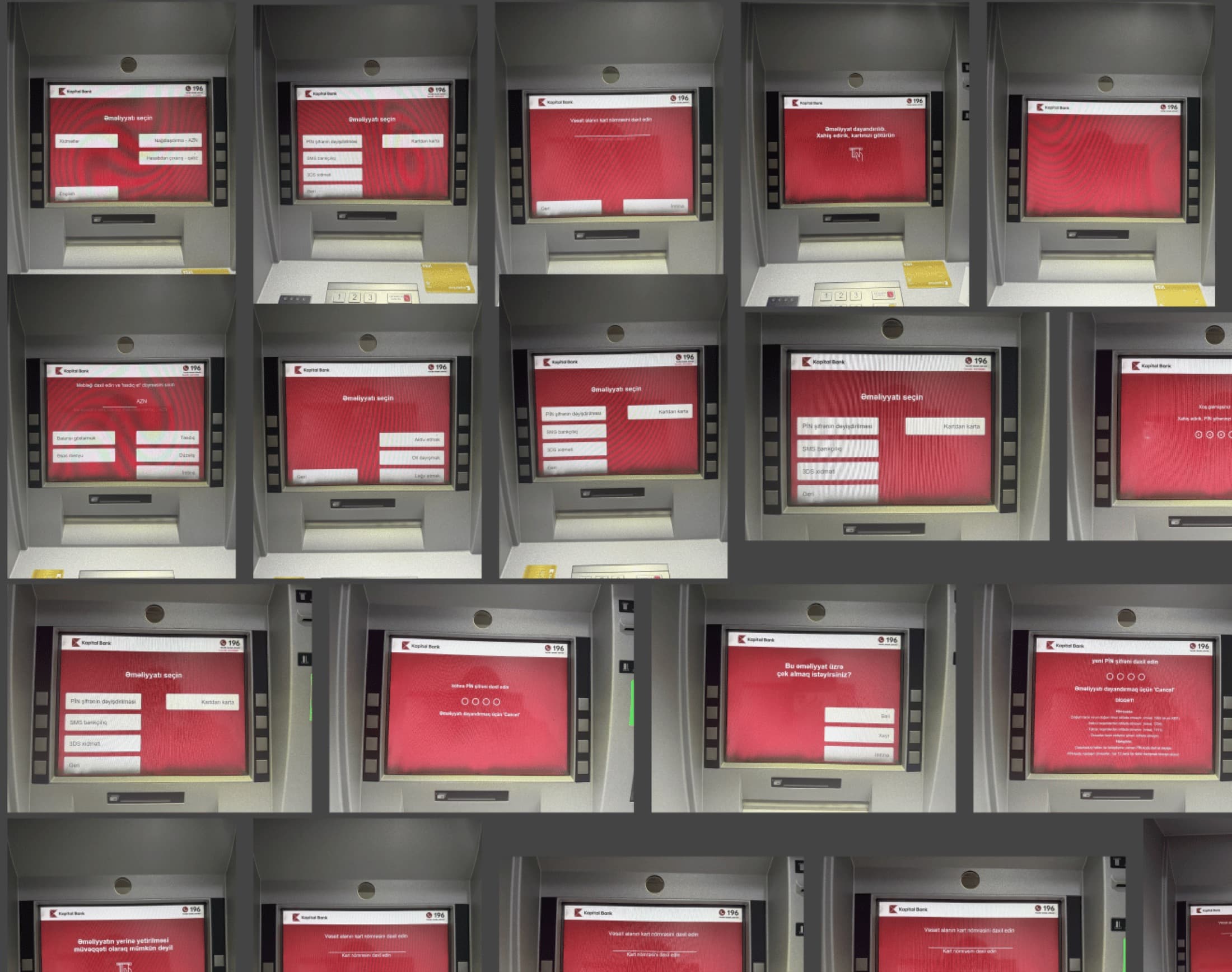
To identify usability pain points across Birbank's ATM network, I collaborated with our UX researcher to conduct comprehensive comparative usability testing of two ATM systems — GRG (New) and Wincor (Old). We recruited 6 participants and conducted moderated in-person testing sessions at two branch locations: Port Baku and Ahmadli. Participants were segmented into those familiar with both systems and those who had only used Wincor ATMs, allowing us to understand different user experiences and mental models.
During testing sessions, we observed users performing essential banking tasks including cash deposits, cash withdrawals, QR-based cardless transactions, NFC payments, balance inquiries, and PIN changes. We combined task-based observation with follow-up questions to understand not just what users did, but why they made certain decisions and where they encountered friction.
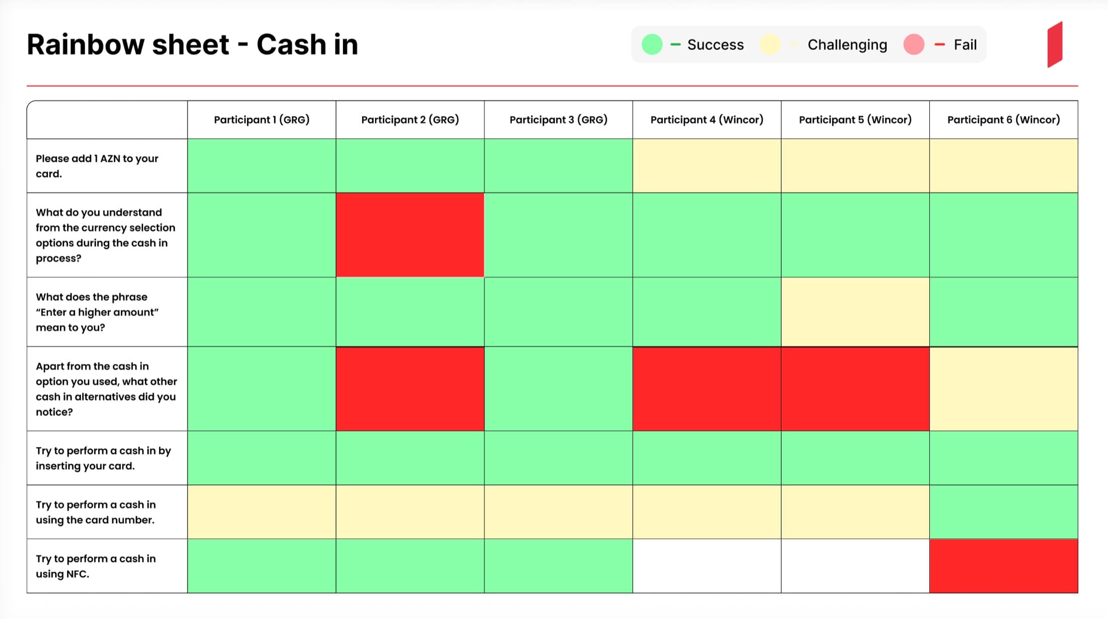
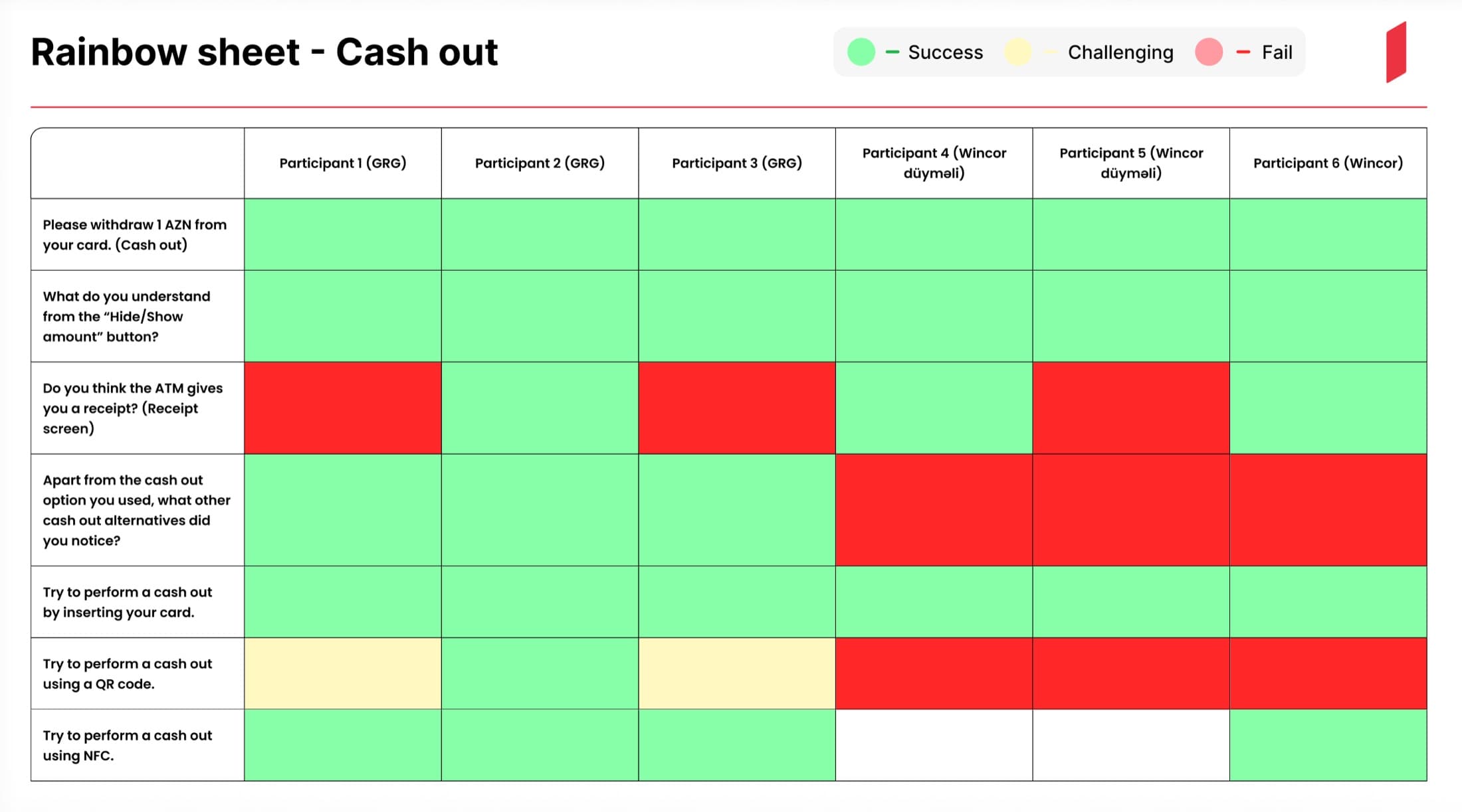
The research uncovered critical usability issues that were driving call center complaints.
- Wincor users finished a QR withdrawal unaided
- 0 / 3
- reached for physical buttons on a touchscreen
- 5 / 6
- branches tested — Port Baku, Ahmadli
- 2
Wincor users struggled significantly with cardless operations—all 3 Wincor participants were unable to complete QR-based withdrawals independently, with many not understanding the process at all. Users couldn't locate alternative payment methods, as these options were buried in nested menus or obscured by promotional banners. Additionally, 5 out of 6 participants across both systems didn't realize the screens were touch-sensitive, attempting to use physical buttons first. Navigation was particularly problematic on Wincor devices, where users had difficulty finding basic functions like balance checks or accessing the services menu.
In contrast, the GRG interface demonstrated significantly better usability. Users found cardless operations more intuitive, discovered alternative payment methods faster, and completed transactions with fewer errors. The visual hierarchy was clearer, touch interactions were more obvious, and the overall information architecture made more sense to users' mental models.
These findings validated our hypothesis that a unified, modern touch-first interface would dramatically improve the ATM experience. The research provided clear direction: eliminate navigation complexity, make cardless operations prominent and understandable, improve visual affordances for touch interaction, and create a consistent experience across all device types. This evidence-based foundation shaped every design decision in the redesign process.
Result
Deployed to 70 devices, support calls down a quarter
The redesigned ATM interface was successfully deployed across 70 next-generation devices, directly addressing the usability issues identified in our research. Within 3-4 months of launch, call center reports related to ATM transactions decreased by 25%, validating that our design solutions had resolved the core pain points users were experiencing.
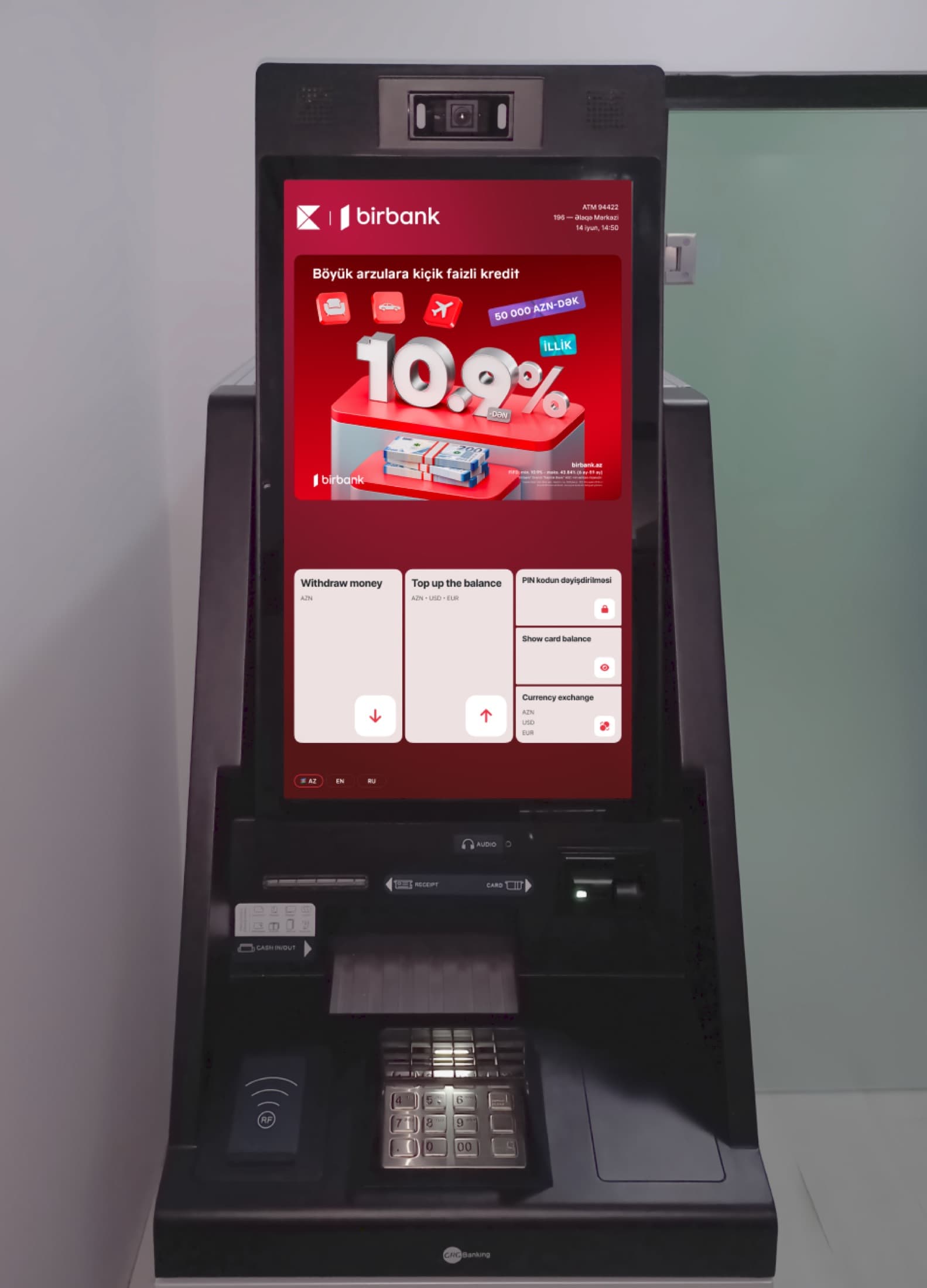
The research-driven improvements had measurable impact on user behavior. Cardless operations, which had been nearly impossible for Wincor users during testing (with 0 out of 3 participants completing QR withdrawals independently), became discoverable and intuitive in the new interface. Users could now easily find and complete transactions using QR codes, NFC, and card numbers without assistance. The touch-first design eliminated the confusion around screen interaction that affected 83% of research participants, making the interface immediately understandable.
Navigation issues that plagued the old Wincor system—where users struggled to find basic functions like balance checks or locate the services menu—were resolved through a simplified information architecture. The new component library, designed across multiple screen sizes, ensured consistency and scalability as Birbank continues expanding its ATM network.
Most importantly, the redesign transformed the daily experience for thousands of Birbank customers, making routine banking tasks faster, clearer, and more accessible. The significant reduction in support calls demonstrated that users could now confidently complete transactions independently—the ultimate measure of successful UX design.
Next project
Birbank — Loan Payment Redesign