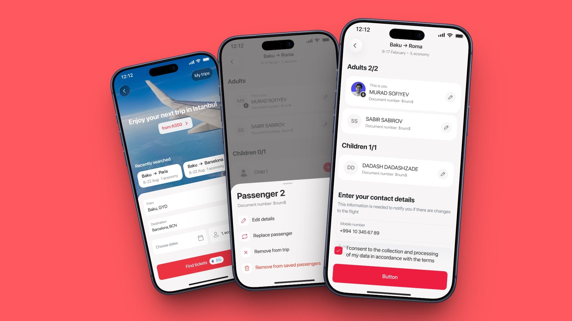
Birbank Travel — Passenger Flow
Birbank Travel is the flight-booking product inside Birbank, Azerbaijan's leading fintech super-app. Booking for someone else — a partner, a parent, a child — is the norm rather than the exception, so the app keeps a list of saved passengers. The step where you attach those passengers to a trip was the weakest part of the flow: it failed usability testing, and removing someone from a trip quietly deleted them from the account.
- Role
- Product Designer III
- Timeline
- 2026
- Platform
- iOS · Android
- Client
- Birbank (Kapital Bank)
- Skills
- Product DesignInteraction DesignFlows & States
- Passenger actions
- 2 → 4
- Users in the study that triggered the rebuild
- 8–10
Background
People rarely book flights just for themselves
Birbank Travel sits inside a banking app that most of the country already has open. That changes who books: people buy tickets for their family in the same session they check a balance, and they buy for the same handful of people over and over.
Saved passengers exist for that reason. A passenger record holds a name, a document number, an expiry date and a nationality — enough friction to type once and never want to type again. Getting those saved people onto a trip is the step this rebuild changed most.
The add flow
Adding a passenger, one seat at a time
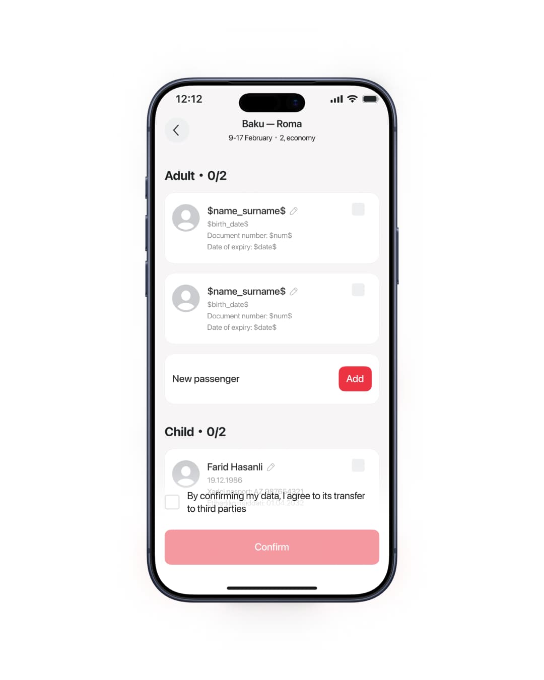
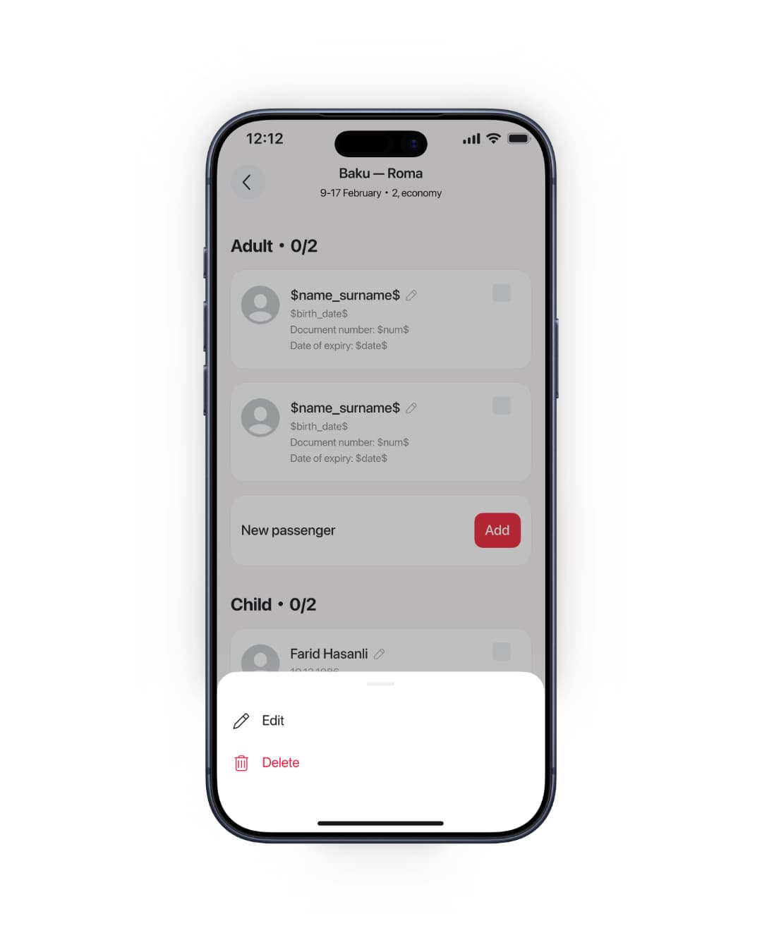
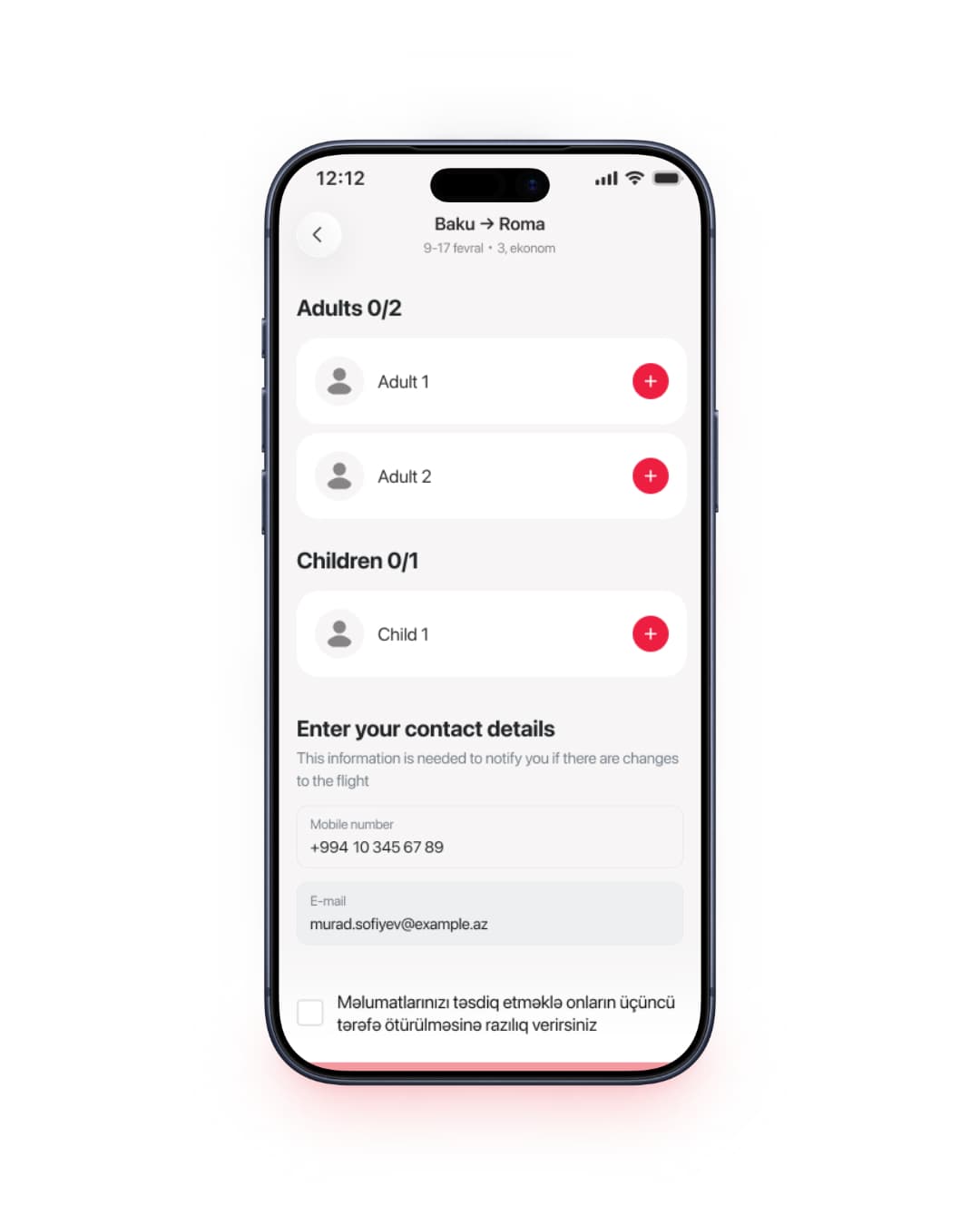
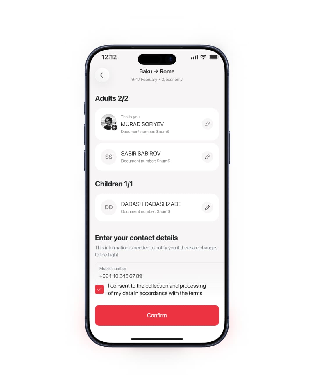
Attaching people to a trip used to mean reconciling a list. The old step showed every saved passenger at once — yourself included — and asked you to tick the ones flying, exactly as many ticks as seats you'd booked. It read as a form to reconcile rather than a choice to make: the list mixed everyone you've ever saved with the two or three on this trip, and nothing moved until the count matched.
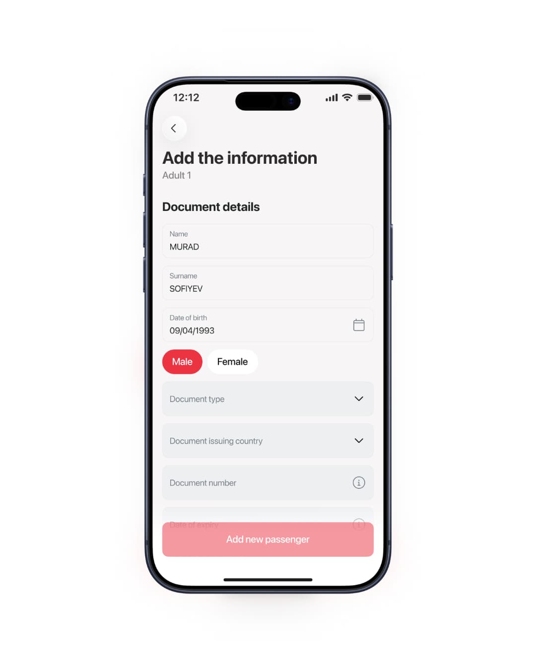
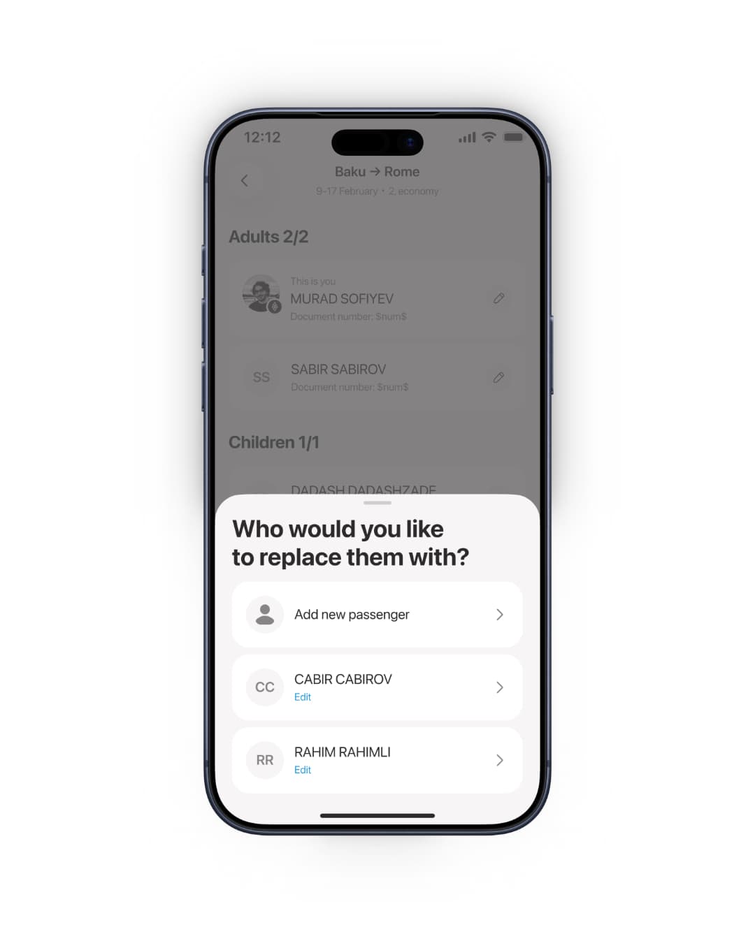
Now each seat is its own empty slot. You tap Add, and a sheet offers your saved passengers and yourself, or Add new passenger — one tap fills one seat, and the trip only ever holds the people you put in it.
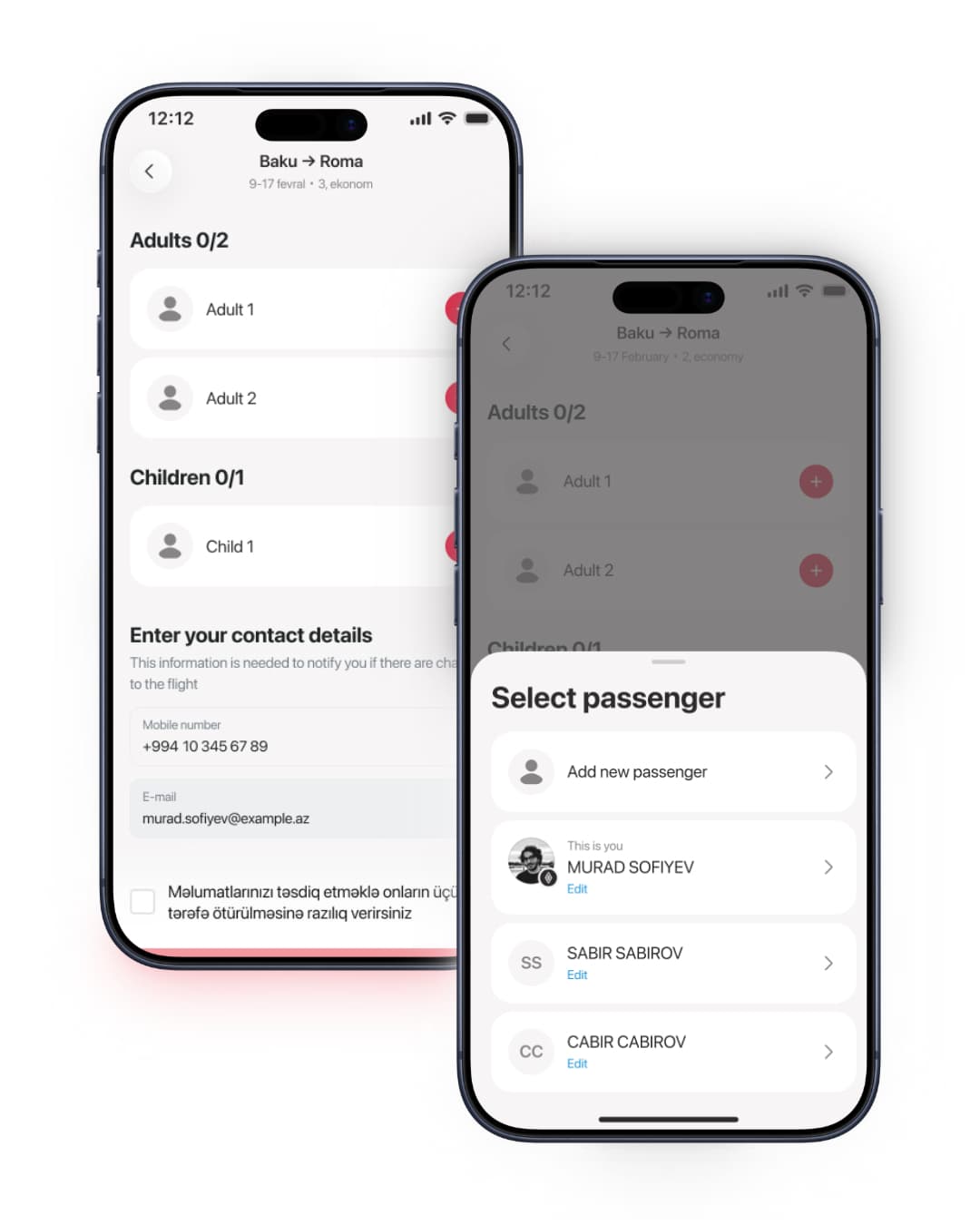
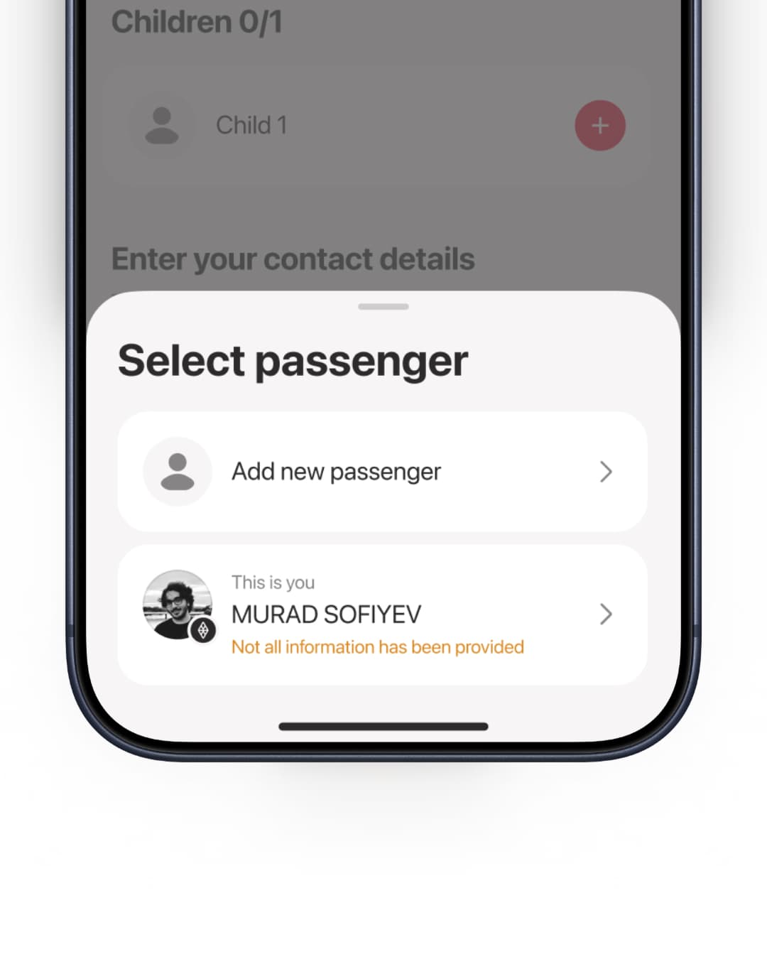
The sheet also closes a gap the old flow ignored: a passenger can only be added once their details are complete. If a document number or expiry date is missing or expired, the flow sends you to finish that record first and then adds them — so an incomplete passenger never lands on the trip.
The problem
One row was doing two jobs
We ran a usability study with 8–10 participants on the existing flow. It did not pass. The failures clustered on the passenger step, and they were not cosmetic:
- Removing a passenger from a trip and deleting them from the account were the same action. Change your mind about who is flying, and the saved record was gone — document number, expiry and all.
- Changing a traveller meant delete, re-add, and retype everything. There was no way to swap one saved passenger for another.
- Every row showed the entire record — name, document number, expiry, nationality — so the list was hardest to scan at exactly the moment you needed to scan it.
- Backend conditions that weren't user errors were pushed to the notification bar, away from the field that caused them and with nothing the user could do about them.
Underneath every one of these was the same mistake: the interface was treating one thing as two different things at once. A passenger on this trip and a saved passenger in my account are separate objects with separate lifecycles — the old UI collapsed them into a single row with a single destructive control.
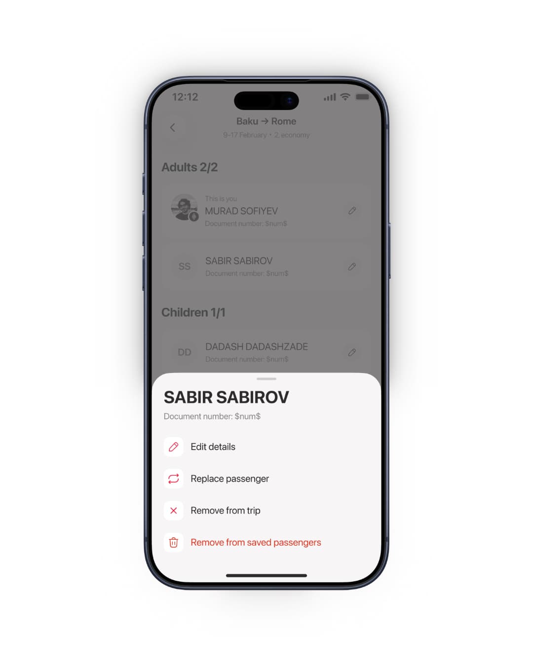
Separating them made the action set fall out on its own:
- Add a saved passenger to this trip
- Replace them with a different saved passenger, without retyping anything
- Remove from this trip — non-destructive, so it needs no confirmation
- Delete from saved passengers — explicitly confirmed, and now the only destructive path
The same split decided what a row should show. A row only has to let you identify a person at booking time, so it carries a name and document status; everything else moved behind it.
Outcome
What shipped
Adding, swapping and dropping passengers is now fast enough to do mid-booking without losing your place, and the flow can no longer destroy a saved record as a side effect of a routine change. That last part is the one I'd defend hardest: the old flow was not just slower, it was wrong.
The rebuild was driven by the failed study rather than validated by a new one. If I were picking up the next round, I'd watch support contacts mentioning lost passenger data, drop-off at the passenger step, and how many bookings use replace — the last one being the clearest signal that the affordance was genuinely missing rather than merely nice.
Next project
Birbank Biznes — Order Tracking for Acquiring